By Douglas M. Campbell
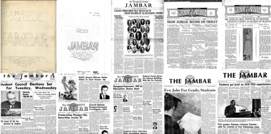
On Wednesday, Jan. 14, 1931, students of Youngstown College released a pamphlet called “The Jambar” that 90 years later remains a staple of the university. A pamphlet whose appearance continuously changes.
In design, according to Robin Williams, graphic designer and educator, there are four principles to keep in mind under the CRAP model: contrast, repetition, alignment and proximity.
Adam Rogers, a managing editor of innovation at The Villages Daily Sun, was a design editor who became a head designer, writer and editor-in-chief at The Jambar from 2006-2010.
“It seems like every new regime that came in, the new editor-in-chief and different folks … and when they hired new designers, everyone wants to put their own mark on it,” Rogers said.
Rogers graduated from YSU in spring 2010 and moved down to Florida where he became a designer for The Villages Daily Sun.
“I kind of really owe my experiences at The Jambar and learning the basics of journalism to that program. I don’t think I would be where I am without that experience,” Rogers said.
The 1930s to 1940s
In the early 1930s, The Jambar’s design was simple. The first issues were six-page pamphlets with two columns on each page. The headlines or titles of stories were all capitalized and the same size as the main text.
Folios, or page numbers, were centered at the top of each page. All pages beyond the staff page were spaced out with campus updates and little-to-no photographs. Important design elements such as alignment of news bulletins and visual repetition and contrast of design occurred rarely.
The paper shortly gained attributes of a newspaper, changing from a pamphlet to a broadsheet format. The masthead, or name of the paper, was bolder, more defined and integrated with front page stories. Folios were placed on the left or right side of the pages.
Pages expanded to include four to five columns per page. Cutlines or captions beneath photographs were included in the paper’s design.
Alignment and repetition of stories and photography placement were improved, but the proximity or spacing of stories was much closer and cluttered to each other compared to today’s Jambar issues.
Continuing into the 1940s, as The Jambar evolved and designers changed, students experimented with the design. To mixed results, students would alter the CRAP principles with the placement and size of the masthead, photography and number of columns.
The 1950s to 1970s
Into the 1950s, imagery would begin to be included more in The Jambar’s design.
Photographs and advertisements alignment and repetition were mixed. The proximity between visuals and stories continuously clashed with rare unions of clarity between the two.
By the 1960s, advertisements expanded to take up to 40 to 60% of some pages.
The 1980s to 1990s
Into the 1980s, The Jambar’s design became less cluttered as the font size of stories increased and a symmetry formed with all of the visual elements. Details such as teasers or stories inside the current issue were placed above the masthead.
Advertisements continued to fill the paper, but their presence was reduced.
The 2000s
Experimentation continued as the design of The Jambar reverted to designs of earlier issues where the proximity of words began to dominate the outline of pages. Designers used Quark, a publishing and design software from 1987.
The Jambar changed the format of the paper from a broadsheet to a tabloid format — the newspaper you probably are holding in your hand).
B.J. Lisko, a design editor and writer for The Canton Repository, was a sports editor and became a head designer at The Jambar during his education from 2001 to 2004.
“When I got there they … switched over to Quark when I got to YSU. They started having colored pages — at least the front and back, anyway — and I think by the end of it, it was mostly color,” Lisko said.
Lisko wanted to be a designer of The Jambar and joined by becoming a sports editor. He learned his skills in design by working for the paper.
“The thing about The Jambar is you got to just learn it on your own. You got to kind of learn to go do, and it gave you the freedom and resources to — figure it out which is pretty much what we did and what I did to learn graphic design,” Lisko said.
Laura McDonough, a copy editor and layout designer at The Tribune Chronicle, was the head designer and editor-in-chief at The Jambar during her education from 2016-2018.
McDonough recalls the shift to a tabloid newspaper.
“When I first got there we used a broadsheet, which is the larger regular paper you think of, and we moved to a tab a year later, which is the smaller paper which is easier to read for students, which is why I think we did it,” McDonough said.
McDonough feels every designer for The Jambar has a style to contribute. Her design philosophy was to keep everything simple in The Jambar’s design.
“Every designer has their own style. Some of them pull from things already there, some create something new; I got the pleasure of creating something entirely new because we moved to the tabloid,” McDonough said.
Today
The Jambar today continues to print stories in a tabloid format printed in color, with the masthead resembling the design of The Vindicator.
In CRAP principles, there is repetition as the style of the paper resembles a magazine with one to two stories per page with a photograph or two highlighting the story.
The Jambar’s 90-year history of newspaper designs is available to view now on Maag’s digital archives website.
